Improving creator discoverability
For this recent case study with Memorisely, the goal was to enhance the discoverability of creatives on Patreon, thereby boosting patron engagement and support for a broader range of creators.
Problem
Presently, searching for content or creators on Patreon leads to a blank page, resulting in minimal user engagement and a significant lack of discoverability for new creators or content.
Solution
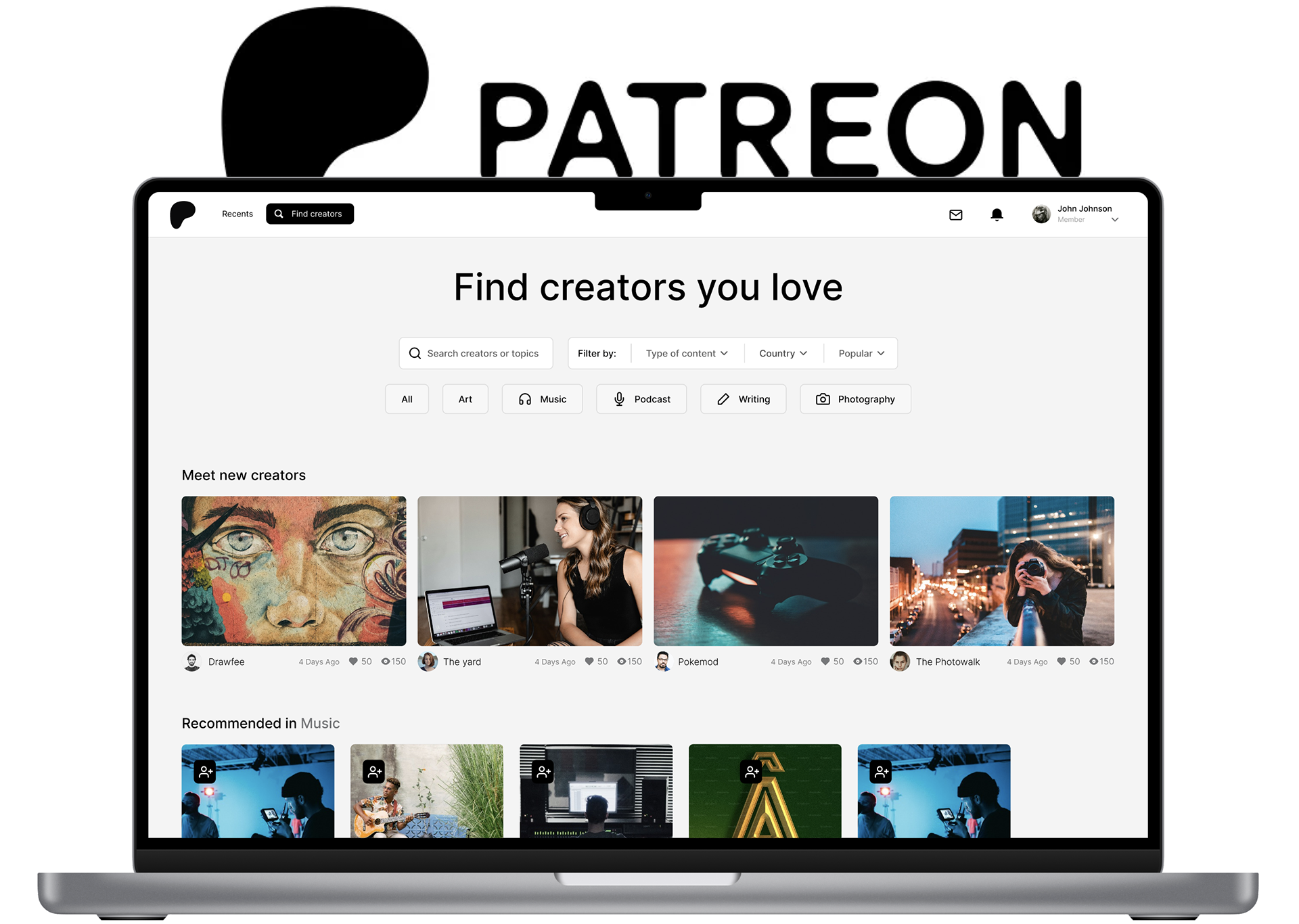
I've revamped the platform to prioritize both content and creators. Users now experience a full-page design, an enhanced recent section for streamlined access to subscriptions, and a completely redesigned search page with an advanced search bar and filters, all centered around content.
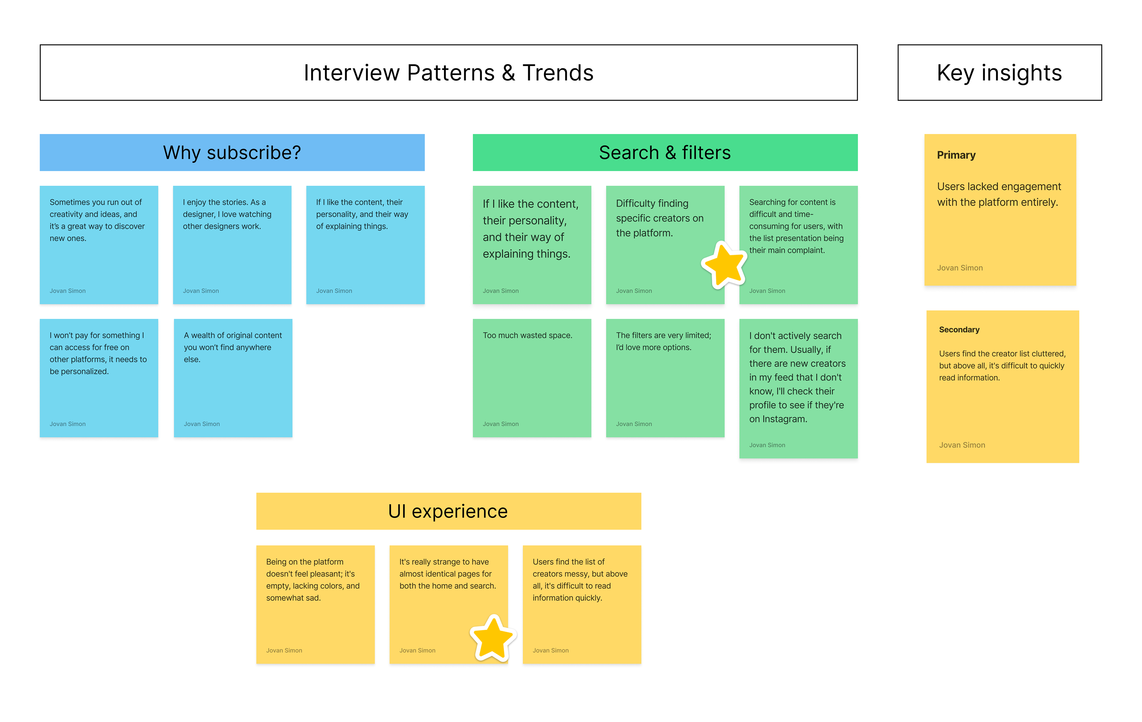
User Interviews
I interviewed users to understand their experiences with Patreon. They mentioned two main problems: feeling unengaged with the platform and finding the interface confusing, especially during searches when content didn't show up properly.
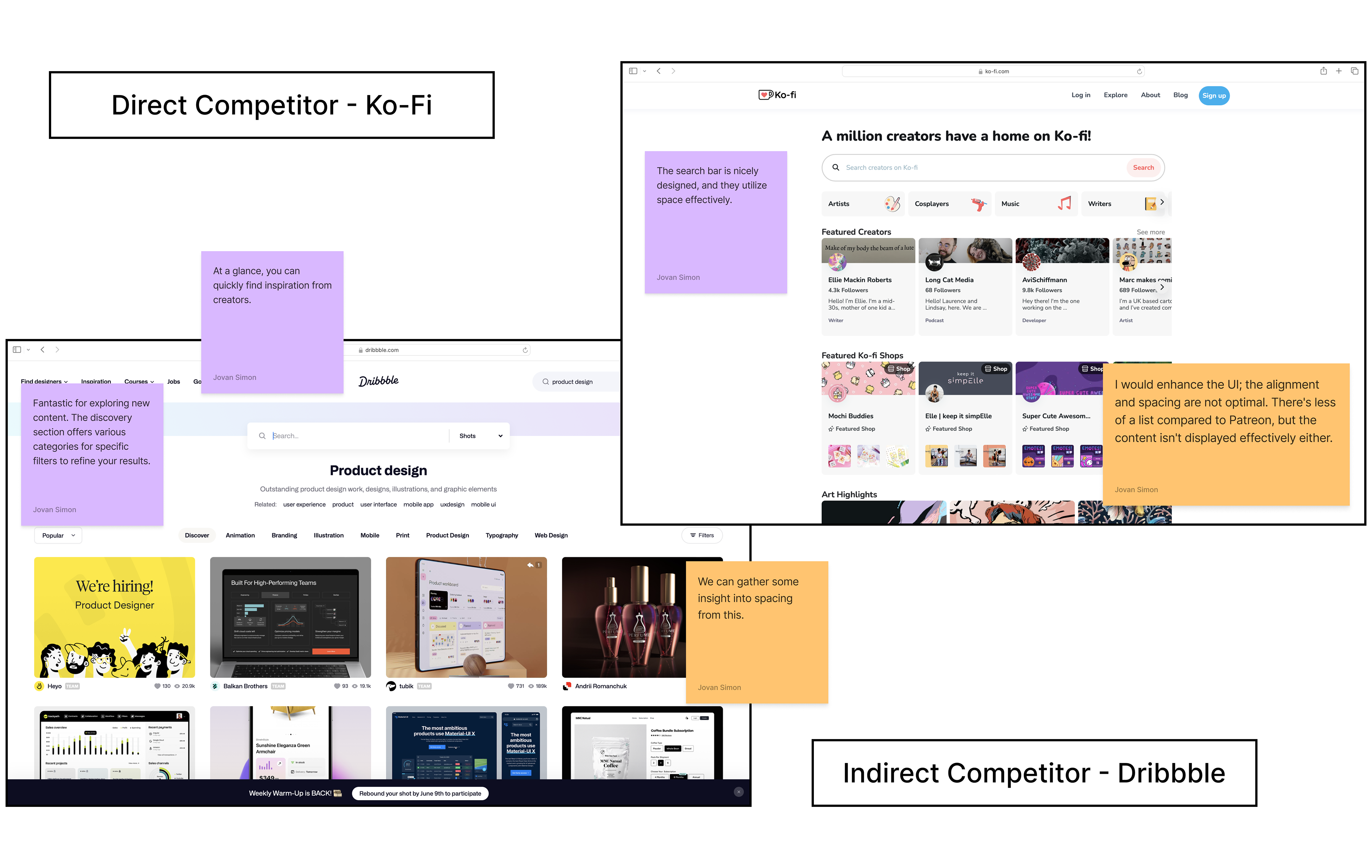
Competitive Benchmarking
I researched content-focused platforms and those designed to assist creators in gaining insight into existing products. I identified Ko-Fi as a direct competitor because it primarily supports creators financially and emphasizes discovering new potential subscriptions. As an indirect competitor, I selected Dribbble, a platform that provides creative ideas for users and focuses primarily on content consumption.
Ideation
That phase is always fun because it allows for putting numerous ideas into writing, which clarifies them.
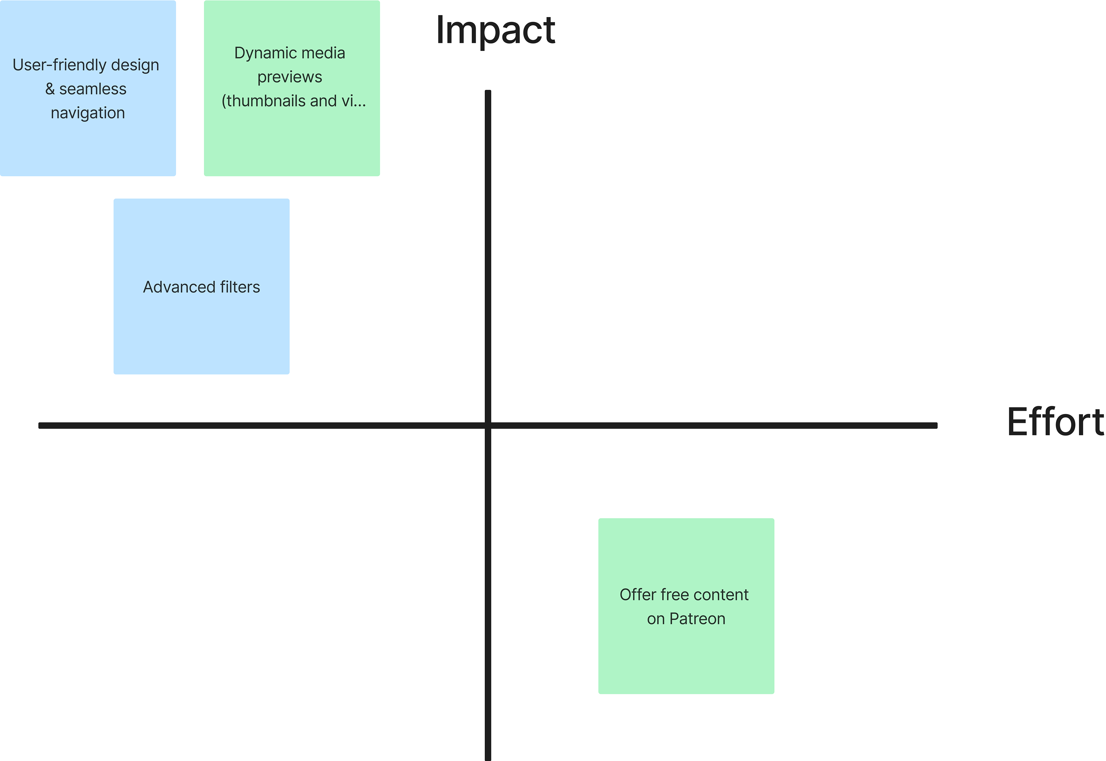
I utilized a mind map to organize my thoughts. I pondered over how I could enhance or introduce features to the overall Patreon redesign. After pinpointing areas for improvement and addition, I employed a matrix to prioritize features that would have a substantial impact on users with minimal effort in their development.
Mind Map ⬇
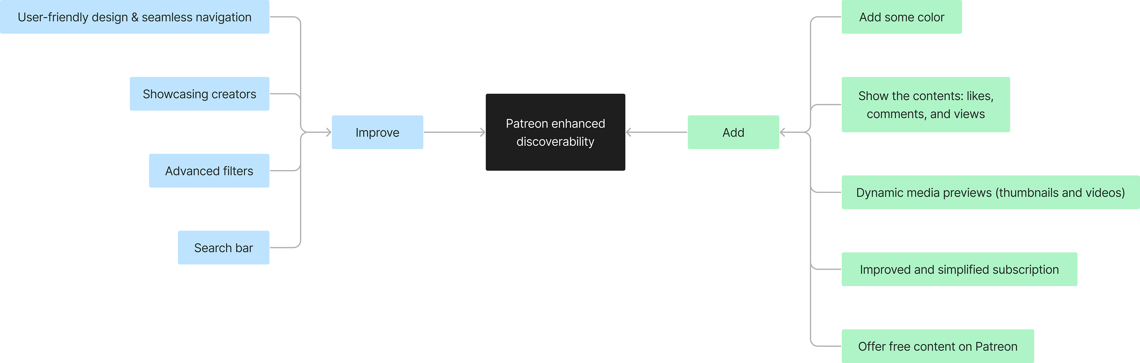
Impact over effort matrix ⬇
UI Styles
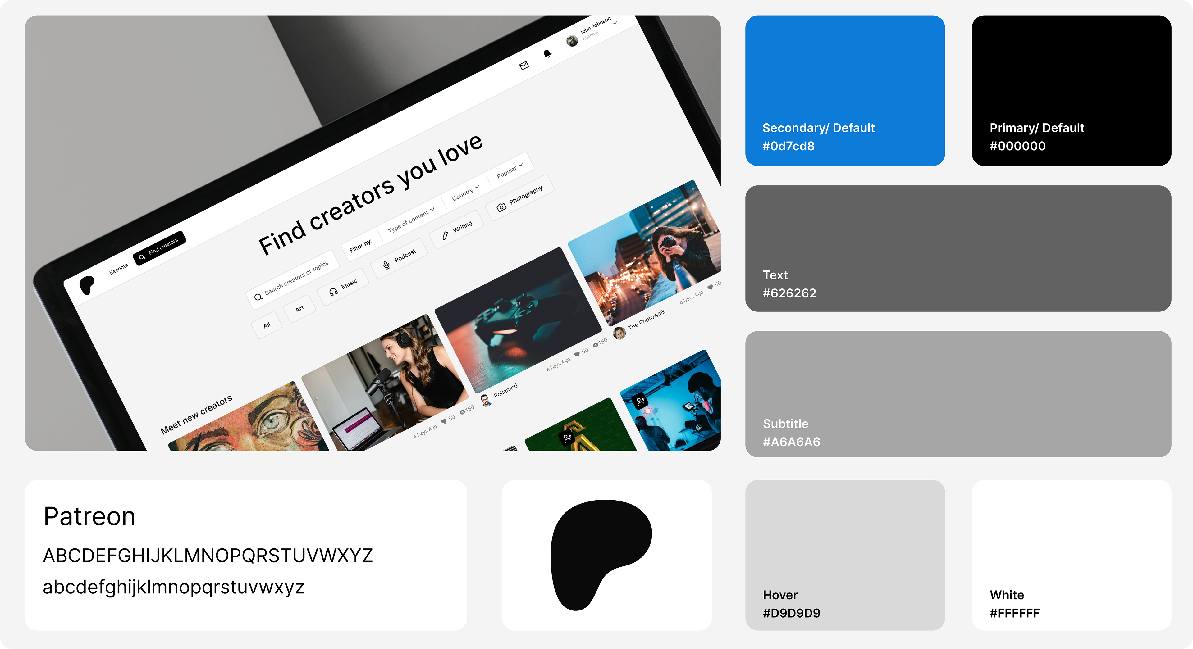
In October 2023, Patreon rebranded to align with their vision for the future of the creator economy and their strong commitment to creators. The new design features a minimalist color palette, primarily black and white, providing a canvas for creators to add vibrant colors to their content.
Wireframes
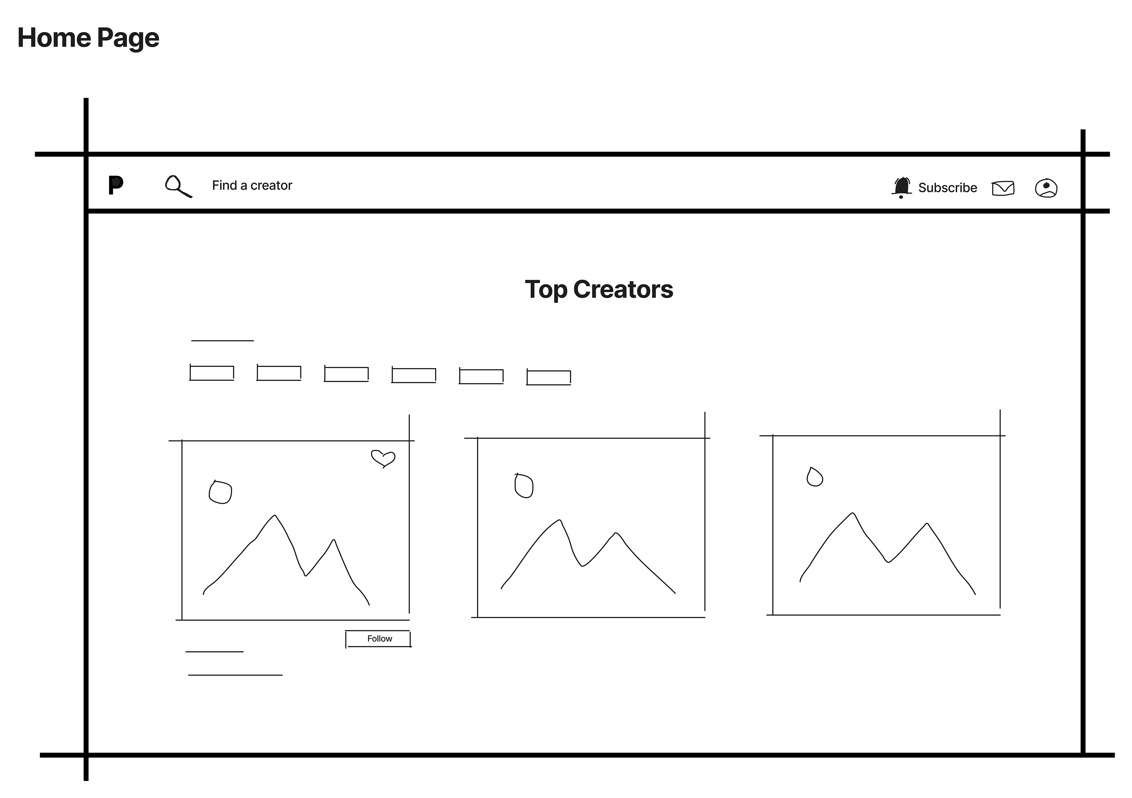
With the UI styles and clearly identified areas of improvement in mind, I began by creating some wireframes. First, I relocated the navigation bar from its original horizontal position on the left side to the top, reducing its size and thereby gaining significant screen real estate - a perfect fit for our content-first approach.
For the design of the recent/home page, I adopted a Dribble-inspired layout. Here, users can find their subscriptions along with the latest available content, and easily like and save posts.
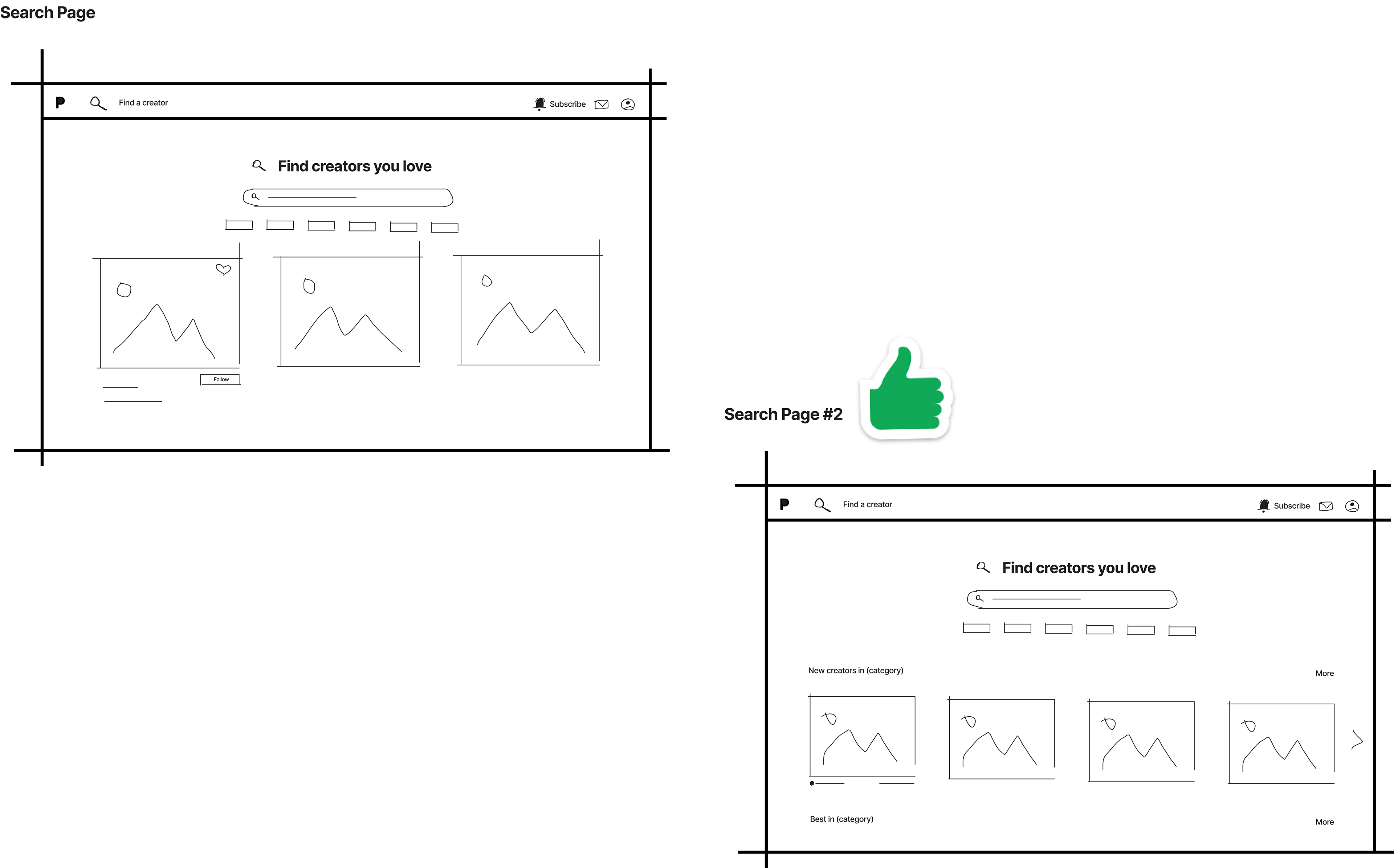
I created two wireframes for the search page and ultimately chose the second one. This design aligns better with our discoverability mission by displaying categories and recommendations, unlike the first one, which might have become cluttered with categories.
High Fidelity Prototype
With my wireframes ready for the design phase, I've begun developing the sign-up process, incorporating various formats and categories for users to select from. I also decided to update the logo in the recent picker on the navigation bar, replacing the star with a friendly people icon that better represents the new subscription-based page.
The recent page features a sleek card design that emphasizes content and text, crucial for creators to engage with their followers. The overall experience is smooth, with micro-interactions integrated throughout. For instance, hovering over different creators on the search page provides a preview of their content.
The card design is dynamic, adapting to the type of content displayed. For example, it features a visually appealing picture card for art photos and switches to an action-oriented layout with play/pause buttons for podcasts. Liking and saving functionalities are consistently available across all content types.
Usability testing
Usability testing is a cornerstone in refining my prototypes, consistently yielding valuable insights. In this instance, users reacted positively to the content-first approach on the search page, finding it intuitive and straightforward. However, opinions were more divided regarding the recent page, with a balanced 50/50 split. While some appreciated the incorporation of their favorite creators, others proposed an Instagram-style scrolling page—a perspective worth exploring further. These direct user insights fuel our commitment to ongoing refinement for optimal user experiences.
Three key learnings
1. Striving for perfection and continuous improvement is a constant endeavoryou're always generating fresh ideas, knowing perfection is elusive.
2. Crafting web products presents greater complexities compared to designing apps.
3. Streamlining language and icons is paramount for ensuring user comprehension.
